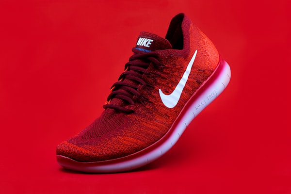
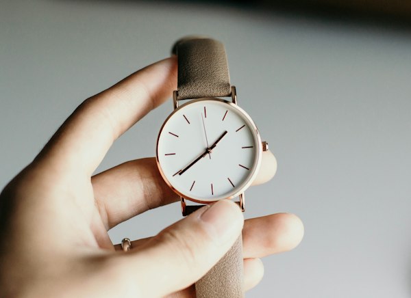
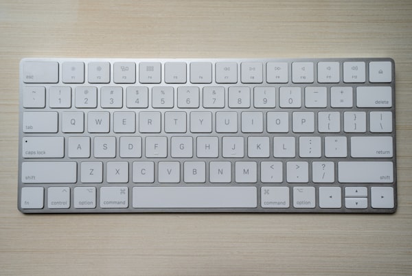
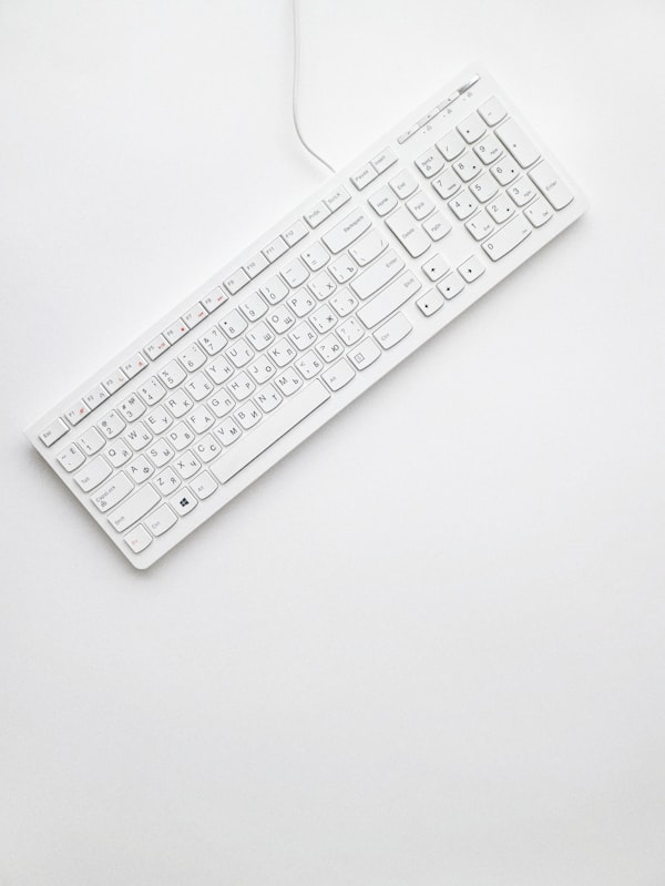
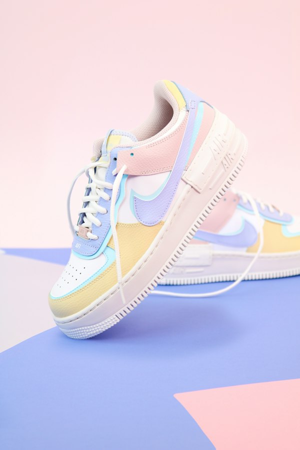
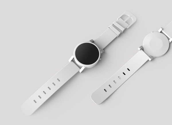
Product Cards A collection of product card designs, featuring various layouts for showcasing products
A collection of product card designs, featuring various layouts for showcasing products. Every card is theme-aware, built with bg-card, border-border, text-foreground, and bg-primary tokens, and uses next/image for optimized images.
A clean, compact product card with an image skeleton, a hover-revealed wishlist toggle, and an animated add-to-cart button.
Preview Code
npx mvpblocks add product-card-minimal Open in
npm pnpm yarn bun npx
pnpm install lucide-react 'use client'; import { cn } from '@/lib/utils'; import { Heart, ShoppingCart } from 'lucide-react'; import Image from 'next/image'; import { useState } from 'react'; interface ProductCardMinimalProps { className?: string; title?: string; category?: string; price?: number; image?: string; isNew?: boolean; } export default function ProductCardMinimal({ className, title = 'Wireless Headphones', category = 'Audio', price = 79.99, image = 'https://images.unsplash.com/photo-1505740420928-5e560c06d30e?w=600&q=80', isNew = true, }: ProductCardMinimalProps) { const [isSaved, setIsSaved] = useState(false); const [isAdding, setIsAdding] = useState(false); const [imgLoaded, setImgLoaded] = useState(false); const handleAddToCart = () => { setIsAdding(true); window.setTimeout(() => setIsAdding(false), 400); }; return ( <article className={cn( 'group bg-card w-full max-w-sm rounded-xl border border-border shadow-sm transition-all duration-300 hover:-translate-y-1 hover:shadow-lg', className, )} > <div className="relative h-64 overflow-hidden rounded-t-xl"> {/* Placeholder pulse while image loads */} <div className={cn( 'bg-muted absolute inset-0 animate-pulse transition-opacity duration-300', imgLoaded ? 'opacity-0' : 'opacity-100', )} /> <Image src={image} alt={title} onLoad={() => setImgLoaded(true)} fill sizes="(max-width: 768px) 100vw, 33vw" loading="lazy" className={cn( 'object-cover transition-all duration-500 group-hover:scale-105', imgLoaded ? 'opacity-100' : 'opacity-0', )} /> {isNew && ( <span className="bg-primary text-primary-foreground absolute top-3 left-3 rounded-md px-2.5 py-1 text-xs font-medium shadow-sm"> New </span> )} {/* Wishlist toggle — appears on hover, stays visible once saved */} <button type="button" onClick={() => setIsSaved((v) => !v)} aria-label={isSaved ? 'Remove from wishlist' : 'Add to wishlist'} className={cn( 'absolute top-3 right-3 flex h-8 w-8 items-center justify-center rounded-full bg-background/90 shadow-sm backdrop-blur transition-all duration-300 hover:bg-background', 'opacity-0 group-hover:opacity-100', isSaved && 'opacity-100', )} > <Heart className={cn( 'h-4 w-4 transition-all duration-200', isSaved ? 'scale-110 fill-red-500 text-red-500' : 'text-muted-foreground', )} /> </button> </div> <div className="space-y-3 p-4"> <div className="flex items-center justify-between"> <span className="text-muted-foreground text-xs font-medium tracking-wider uppercase"> {category} </span> <span className="text-foreground text-lg font-bold"> ${price.toFixed(2)} </span> </div> <h3 className="text-foreground text-base font-semibold">{title}</h3> <button type="button" onClick={handleAddToCart} className="bg-primary text-primary-foreground hover:bg-primary/90 focus-visible:ring-ring flex w-full items-center justify-center gap-2 rounded-lg px-4 py-2.5 text-sm font-medium transition-all duration-200 focus-visible:ring-2 focus-visible:ring-offset-2 focus-visible:outline-none active:scale-95" > <ShoppingCart className={cn( 'h-4 w-4 transition-transform duration-300', isAdding && 'scale-125 -rotate-6', )} aria-hidden="true" /> {isAdding ? 'Added' : 'Add to Cart'} </button> </div> </article> ); } Expand
import ProductCardMinimal from "@/components/craft-blocks/cards/product/product-card-minimal" ; export default function MyComponent () { return ( < div className = "flex items-center justify-center p-8" > < ProductCardMinimal title = "Wireless Headphones" category = "Audio" price = { 79.99 } image = "https://images.unsplash.com/photo-1505740420928-5e560c06d30e?w=600&q=80" isNew /> </ div > ); } Prop Type Default classNamestringundefinedtitlestring"Wireless Headphones"categorystring"Audio"pricenumber79.99imagestringUnsplash headphones photo isNewbooleantrue
Wishlist toggle — Heart button appears on hover and persists once activated"New" badge — Conditional badge in the top-left cornerAdd to Cart — Animated button with visual feedback on clickImage lazy loading — Smooth reveal with a skeleton pulse placeholder
Card lift — hover:-translate-y-1 with hover:shadow-lg for a subtle elevation effectImage zoom — group-hover:scale-105 on the image for a gentle zoomWishlist reveal — Button transitions from opacity-0 to opacity-100 on card hoverHeart fill — scale-110 and fill-red-500 on toggleCart feedback — Cart icon scales and rotates (scale-125 -rotate-6) on addSkeleton loading — animate-pulse placeholder fades out as the image loads
A content-rich card with a staggered star rating, discount badge, strikethrough pricing, and an animated add-to-cart button.
Preview Code
npx mvpblocks add product-card-modern Open in
npm pnpm yarn bun npx
pnpm install lucide-react 'use client'; import { cn } from '@/lib/utils'; import { Heart, ShoppingCart, Star } from 'lucide-react'; import Image from 'next/image'; import { useState } from 'react'; interface ProductCardModernProps { className?: string; title?: string; category?: string; description?: string; price?: number; previousPrice?: number; image?: string; rating?: number; reviewCount?: number; discount?: number; } export default function ProductCardModern({ className, title = 'Running Shoes', category = 'Footwear', description = 'Lightweight and responsive running shoes with breathable mesh upper and cushioned sole for maximum comfort.', price = 89.99, previousPrice = 129.99, image = 'https://images.unsplash.com/photo-1542291026-7eec264c27ff?w=600&q=80', rating = 4, reviewCount = 128, discount = 31, }: ProductCardModernProps) { const [isWishlisted, setIsWishlisted] = useState(false); const [isAdding, setIsAdding] = useState(false); const handleAddToCart = () => { setIsAdding(true); window.setTimeout(() => setIsAdding(false), 400); }; return ( <article className={cn( 'group bg-card w-full max-w-sm rounded-xl border border-border shadow-sm transition-all duration-300 hover:-translate-y-1 hover:shadow-lg', className, )} > <div className="relative h-72 overflow-hidden rounded-t-xl"> <Image src={image} alt={title} fill sizes="(max-width: 768px) 100vw, 33vw" loading="lazy" className="object-cover transition-transform duration-500 group-hover:scale-105" /> <div className="absolute inset-0 bg-linear-to-t from-black/20 to-transparent opacity-0 transition-opacity duration-300 group-hover:opacity-100" /> {/* Wishlist — sole occupant of the image overlay now */} <button type="button" onClick={() => setIsWishlisted((prev) => !prev)} className="focus-visible:ring-ring absolute top-3 right-3 flex h-9 w-9 items-center justify-center rounded-full bg-background/80 backdrop-blur-sm transition-all duration-200 hover:scale-105 hover:bg-background/90 focus-visible:ring-2 focus-visible:ring-offset-2 focus-visible:outline-none" aria-label={isWishlisted ? 'Remove from wishlist' : 'Add to wishlist'} > <Heart className={cn( 'h-5 w-5 transition-all duration-200', isWishlisted ? 'scale-110 fill-red-500 text-red-500' : 'text-muted-foreground', )} /> </button> </div> <div className="space-y-3 p-4"> <span className="text-muted-foreground text-xs font-medium tracking-wider uppercase"> {category} </span> <h3 className="text-foreground text-base font-semibold">{title}</h3> <p className="text-muted-foreground line-clamp-2 text-sm leading-relaxed text-ellipsis"> {description} </p> <div className="flex items-center gap-1.5"> {[1, 2, 3, 4, 5].map((star) => ( <Star key={star} className={cn( 'h-4 w-4 transition-transform duration-200 group-hover:scale-110', star <= rating ? 'fill-primary text-primary' : 'fill-none text-border', )} style={{ transitionDelay: `${star * 40}ms` }} /> ))} <span className="text-muted-foreground ml-1 text-xs"> ({reviewCount} reviews) </span> </div> {/* Price + discount now share one visual unit, same accent color */} <div className="flex items-baseline gap-2"> <span className="text-foreground text-xl font-bold"> ${price.toFixed(2)} </span> {previousPrice && ( <span className="text-muted-foreground text-sm line-through"> ${previousPrice.toFixed(2)} </span> )} {discount > 0 && ( <span className="text-primary text-xs font-semibold"> -{discount}% </span> )} </div> <button type="button" onClick={handleAddToCart} className="bg-primary text-primary-foreground hover:bg-primary/90 focus-visible:ring-ring flex w-full items-center justify-center gap-2 rounded-lg px-4 py-2.5 text-sm font-medium transition-all duration-200 focus-visible:ring-2 focus-visible:ring-offset-2 focus-visible:outline-none active:scale-95" > <ShoppingCart className={cn( 'h-4 w-4 transition-transform duration-300', isAdding && 'scale-125 -rotate-6', )} aria-hidden="true" /> {isAdding ? 'Added' : 'Add to Cart'} </button> </div> </article> ); } Expand
import ProductCardModern from "@/components/craft-blocks/cards/product/product-card-modern" ; export default function MyComponent () { return ( < div className = "flex items-center justify-center p-8" > < ProductCardModern title = "Running Shoes" category = "Footwear" price = { 89.99 } previousPrice = { 129.99 } image = "https://images.unsplash.com/photo-1542291026-7eec264c27ff?w=600&q=80" rating = { 4 } reviewCount = { 128 } discount = { 31 } /> </ div > ); } Prop Type Default classNamestringundefinedtitlestring"Running Shoes"categorystring"Footwear"descriptionstring"Lightweight and responsive running shoes..." pricenumber89.99previousPricenumber129.99imagestringUnsplash running shoes photo ratingnumber4reviewCountnumber128discountnumber31
Star rating display — Five stars with staggered hover animationDiscount badge — Percentage-off label next to the strikethrough original priceProduct description — Truncated to 2 lines with line-clamp-2Wishlist toggle — Heart button with backdrop blurAdd to Cart — Animated button with visual feedback
Card lift — hover:-translate-y-1 with hover:shadow-lg elevationImage zoom — group-hover:scale-105 on hoverGradient overlay — bg-linear-to-t from-black/20 fades in on the image areaStaggered stars — Each star scales up with a transitionDelay of star * 40msHeart fill — scale-110 and fill-red-500 on activationCart feedback — Icon scale-125 -rotate-6 on click
A quiet, catalog-style card with serif typography, a hover-revealed reference number, and an animated Discover CTA.
Preview Code
npx mvpblocks add product-card-premium Open in
npm pnpm yarn bun npx
pnpm install lucide-react 'use client'; import { cn } from '@/lib/utils'; import { ArrowUpRight } from 'lucide-react'; import Image from 'next/image'; import { useState } from 'react'; interface ProductCardPremiumProps { className?: string; title?: string; reference?: string; category?: string; description?: string; price?: number; image?: string; isPremium?: boolean; } export default function ProductCardPremium({ className, title = 'Heritage Chronograph', reference = 'Ref. 5172G-001', category = 'Luxury Watches', description = 'Swiss-made automatic movement with sapphire crystal, genuine leather strap, and a refined sunburst dial. Water-resistant to 100 meters.', price = 1250.0, image = 'https://images.unsplash.com/photo-1524592094714-0f0654e20314?w=600&q=80', isPremium = true, }: ProductCardPremiumProps) { const [isHovered, setIsHovered] = useState(false); return ( <article onMouseEnter={() => setIsHovered(true)} onMouseLeave={() => setIsHovered(false)} className={cn( 'group w-full max-w-sm overflow-hidden rounded-sm border border-border bg-card transition-all duration-700 ease-out hover:border-foreground/20 hover:shadow-theme-md', className, )} > <div className="relative h-80 overflow-hidden"> <Image src={image} alt={title} fill sizes="(max-width: 768px) 100vw, 33vw" loading="lazy" className="object-cover transition-transform duration-[1200ms] ease-out group-hover:scale-[1.04]" /> <div className="pointer-events-none absolute inset-0 bg-linear-to-t from-black/40 via-transparent to-transparent opacity-0 transition-opacity duration-700 group-hover:opacity-100" /> {isPremium && ( <span className="absolute top-5 left-5 border border-white/40 px-3 py-1 text-[10px] font-light tracking-[0.25em] text-white uppercase"> Limited Edition </span> )} {/* Reference number surfaces only on hover — a quiet, catalog-like detail */} <span className={cn( 'absolute right-5 bottom-5 text-[11px] font-light tracking-wider text-white/90 transition-all duration-700', isHovered ? 'translate-y-0 opacity-100' : 'translate-y-1 opacity-0', )} > {reference} </span> </div> <div className="space-y-5 px-7 py-8"> <div className="space-y-2"> <span className="text-muted-foreground text-[10px] font-medium tracking-[0.25em] uppercase"> {category} </span> <h3 className="font-serif text-2xl leading-snug font-medium tracking-tight text-foreground"> {title} </h3> </div> <div className="h-px w-8 bg-border transition-all duration-700 group-hover:w-16" /> <p className="text-muted-foreground text-[13px] leading-relaxed"> {description} </p> <div className="flex items-end justify-between pt-3"> <span className="text-foreground text-lg font-light tracking-tight"> $ {price.toLocaleString('en-US', { minimumFractionDigits: 2, maximumFractionDigits: 2, })} </span> <button type="button" className="group/btn flex items-center gap-1.5 border-b border-foreground pb-1 text-foreground text-[13px] font-medium tracking-wide transition-all duration-300 hover:gap-2.5 hover:border-muted-foreground focus-visible:outline-none" > Discover <ArrowUpRight className="h-3.5 w-3.5 transition-transform duration-300 group-hover/btn:translate-x-0.5 group-hover/btn:-translate-y-0.5" aria-hidden="true" /> </button> </div> </div> </article> ); } Expand
import ProductCardPremium from "@/components/craft-blocks/cards/product/product-card-premium" ; export default function MyComponent () { return ( < div className = "flex items-center justify-center p-8" > < ProductCardPremium title = "Heritage Chronograph" reference = "Ref. 5172G-001" category = "Luxury Watches" price = { 1250 } image = "https://images.unsplash.com/photo-1524592094714-0f0654e20314?w=600&q=80" isPremium /> </ div > ); } Prop Type Default classNamestringundefinedtitlestring"Heritage Chronograph"referencestring"Ref. 5172G-001"categorystring"Luxury Watches"descriptionstring"Swiss-made automatic movement..." pricenumber1250imagestringUnsplash watch photo isPremiumbooleantrue
"Limited Edition" badge — Premium border badge in the top-leftReference number — Slides up on hover for a catalog-like detailDiscover CTA — Button with animated arrow that translates on hoverSerif typography — font-serif for the product title, light font weights throughout
Image zoom — group-hover:scale-[1.04] over 1200ms for a slow, cinematic revealGradient overlay — Fades in over 700ms on hover, from black/40 to transparentReference number — Translates translate-y-1 to translate-y-0 with an opacity fadeDivider line — Expands from w-8 to w-16 on hover over 700msArrow animation — Diagonal nudge on the Discover arrow on hoverButton spacing — hover:gap-2.5 widens the gap between text and arrowRounded corners — Uses rounded-sm for a sharper, more refined look
A playful image carousel card with 3D tilt, auto-play on hover, swipe support, and pill-shaped dot indicators.
Preview Code
npx mvpblocks add product-card-carrossel Open in
npm pnpm yarn bun npx
pnpm install lucide-react 'use client'; import { cn } from '@/lib/utils'; import { ChevronLeft, ChevronRight, ShoppingCart, Star } from 'lucide-react'; import Image from 'next/image'; import { useEffect, useRef, useState } from 'react'; interface ProductCardCarrosselProps { className?: string; title?: string; category?: string; price?: number; rating?: number; reviewCount?: number; images?: string[]; } const AUTO_PLAY_INTERVAL = 1600; export default function ProductCardCarrossel({ className, title = 'Mechanical Keyboard', category = 'Accessories', price = 149.99, rating = 4.5, reviewCount = 324, images = [ 'https://images.unsplash.com/photo-1587829741301-dc798b83add3?w=600&q=80', 'https://images.unsplash.com/photo-1541140532154-b024d705b90a?w=600&q=80', ], }: ProductCardCarrosselProps) { const [index, setIndex] = useState(0); const [isHovered, setIsHovered] = useState(false); const [tilt, setTilt] = useState({ x: 0, y: 0 }); const [isAdding, setIsAdding] = useState(false); const cardRef = useRef<HTMLElement>(null); const dragStartX = useRef<number | null>(null); const autoplayRef = useRef<ReturnType<typeof setInterval> | null>(null); const goTo = (i: number) => { setIndex((i + images.length) % images.length); }; // Auto-advance only while hovered — the carousel "introduces itself" useEffect(() => { if (isHovered) { autoplayRef.current = setInterval(() => { setIndex((prev) => (prev + 1) % images.length); }, AUTO_PLAY_INTERVAL); } return () => { if (autoplayRef.current) clearInterval(autoplayRef.current); }; }, [isHovered, images.length]); const handleMouseMove = (e: React.MouseEvent<HTMLElement>) => { if (!cardRef.current) return; const rect = cardRef.current.getBoundingClientRect(); const px = (e.clientX - rect.left) / rect.width - 0.5; const py = (e.clientY - rect.top) / rect.height - 0.5; setTilt({ x: py * -4, y: px * 6 }); }; const resetTilt = () => { setIsHovered(false); setTilt({ x: 0, y: 0 }); }; const handlePointerDown = (e: React.PointerEvent) => { dragStartX.current = e.clientX; }; const handlePointerUp = (e: React.PointerEvent) => { if (dragStartX.current === null) return; const delta = e.clientX - dragStartX.current; if (Math.abs(delta) > 40) { goTo(delta > 0 ? index - 1 : index + 1); } dragStartX.current = null; }; const handleAddToCart = () => { setIsAdding(true); window.setTimeout(() => setIsAdding(false), 400); }; return ( <article ref={cardRef} onMouseEnter={() => setIsHovered(true)} onMouseMove={handleMouseMove} onMouseLeave={resetTilt} style={{ transform: `perspective(1000px) rotateX(${tilt.x}deg) rotateY(${tilt.y}deg)`, transformStyle: 'preserve-3d', }} className={cn( 'bg-card w-full max-w-sm rounded-xl border border-border shadow-sm transition-[transform,box-shadow] duration-300 ease-out will-change-transform hover:shadow-xl', className, )} > <div className="relative h-64 touch-pan-y overflow-hidden rounded-t-xl select-none" onPointerDown={handlePointerDown} onPointerUp={handlePointerUp} > {/* Slides — translateX with a slight overshoot easing, distinct from the scale hovers used elsewhere */} <div className="flex h-full transition-transform duration-500 ease-[cubic-bezier(0.34,1.56,0.64,1)]" style={{ transform: `translateX(-${index * 100}%)` }} > {images.map((src, i) => ( <div key={src} className="relative h-full w-full flex-shrink-0"> <Image src={src} alt={`${title} — ${i + 1}`} fill sizes="(max-width: 768px) 100vw, 33vw" loading="lazy" draggable={false} className="object-cover" /> </div> ))} </div> {/* Arrows fade in on hover only */} <button type="button" onClick={() => goTo(index - 1)} aria-label="Previous image" className={cn( 'absolute top-1/2 left-2 flex h-7 w-7 -translate-y-1/2 items-center justify-center rounded-full bg-background/90 text-foreground shadow-sm backdrop-blur transition-all duration-200', isHovered ? 'opacity-100' : 'pointer-events-none opacity-0', )} > <ChevronLeft className="h-4 w-4" /> </button> <button type="button" onClick={() => goTo(index + 1)} aria-label="Next image" className={cn( 'absolute top-1/2 right-2 flex h-7 w-7 -translate-y-1/2 items-center justify-center rounded-full bg-background/90 text-foreground shadow-sm backdrop-blur transition-all duration-200', isHovered ? 'opacity-100' : 'pointer-events-none opacity-0', )} > <ChevronRight className="h-4 w-4" /> </button> {/* Dots — active one stretches into a pill instead of just changing color */} <div className="absolute bottom-3 left-1/2 flex -translate-x-1/2 gap-1.5"> {images.map((_, i) => ( <button key={i} type="button" onClick={() => goTo(i)} aria-label={`Go to image ${i + 1}`} className={cn( 'h-1.5 rounded-full bg-white/60 shadow-sm transition-all duration-300', i === index ? 'w-5 bg-white' : 'w-1.5 hover:bg-white/90', )} /> ))} </div> </div> <div className="space-y-3 p-4"> <span className="text-muted-foreground text-xs font-medium tracking-wider uppercase"> {category} </span> <h3 className="text-foreground text-base font-semibold">{title}</h3> <div className="flex items-center gap-3"> <div className="flex items-center gap-0.5"> {[1, 2, 3, 4, 5].map((star) => { const filled = star <= Math.floor(rating); const half = !filled && star === Math.ceil(rating) && rating % 1 !== 0; return ( <Star key={star} className={cn( 'h-4 w-4', filled ? 'fill-primary text-primary' : half ? 'fill-primary/50 text-primary' : 'fill-none text-border', )} aria-hidden="true" /> ); })} </div> <span className="text-muted-foreground text-xs">({reviewCount})</span> </div> <div className="flex items-center justify-between pt-1"> <span className="text-foreground text-xl font-bold"> ${price.toFixed(2)} </span> <button type="button" onClick={handleAddToCart} className="bg-primary text-primary-foreground hover:bg-primary/90 focus-visible:ring-ring inline-flex items-center gap-2 rounded-lg px-4 py-2 text-sm font-medium transition-all duration-200 focus-visible:ring-2 focus-visible:ring-offset-2 focus-visible:outline-none active:scale-95" > <ShoppingCart className={cn( 'h-4 w-4 transition-transform duration-300', isAdding && 'scale-125 -rotate-6', )} aria-hidden="true" /> {isAdding ? 'Added' : 'Add to Cart'} </button> </div> </div> </article> ); } Expand
import ProductCardCarrossel from "@/components/craft-blocks/cards/product/product-card-carrossel" ; export default function MyComponent () { return ( < div className = "flex items-center justify-center p-8" > < ProductCardCarrossel title = "Mechanical Keyboard" category = "Accessories" price = { 149.99 } rating = { 4.5 } reviewCount = { 324 } images = {[ "https://images.unsplash.com/photo-1587829741301-dc798b83add3?w=600&q=80" , "https://images.unsplash.com/photo-1541140532154-b024d705b90a?w=600&q=80" , ]} /> </ div > ); } Prop Type Default classNamestringundefinedtitlestring"Mechanical Keyboard"categorystring"Accessories"pricenumber149.99ratingnumber4.5reviewCountnumber324imagesstring[]Two Unsplash keyboard photos
Image carousel — Swipeable and arrow-navigable image galleryAuto-play — Automatically advances images at 1.6s intervals on hover3D tilt effect — Perspective transform follows mouse movementStar rating — Supports full, half, and empty star statesDot indicators — Active dot stretches into a pill shapeSwipe support — Pointer events with a 40px thresholdAdd to Cart — Animated button with visual feedback
3D tilt — perspective(1000px) with rotateX()/rotateY() computed from mouse positionSlide transition — cubic-bezier(0.34, 1.56, 0.64, 1) for an overshoot easingAuto-play — Starts on mouseenter, stops on mouseleaveNavigation arrows — Fade in on hoverDot pill — Active dot expands from w-1.5 to w-5Cart feedback — Icon scale-125 -rotate-6 on add
A full-bleed image card that prioritizes the deal: a pulsing discount badge, price comparison, and a slide-up "Shop Now" CTA.
Preview Code
npx mvpblocks add product-card-discount Open in
npm pnpm yarn bun npx
pnpm install lucide-react 'use client'; import { cn } from '@/lib/utils'; import { ShoppingCart } from 'lucide-react'; import Image from 'next/image'; import { useState } from 'react'; interface ProductCardDiscountProps { className?: string; title?: string; category?: string; originalPrice?: number; discountedPrice?: number; discountPercent?: number; image?: string; } export default function ProductCardDiscount({ className, title = 'Running Shoes', category = 'Footwear', originalPrice = 189.99, discountedPrice = 132.99, discountPercent = 31, image = 'https://images.unsplash.com/photo-1595950653106-6c9ebd614d3a?w=600&q=80', }: ProductCardDiscountProps) { const [isAdding, setIsAdding] = useState(false); const handleAddToCart = () => { setIsAdding(true); window.setTimeout(() => setIsAdding(false), 400); }; return ( <article className={cn( 'group relative h-[520px] w-full max-w-sm overflow-hidden rounded-xl border border-border p-2 shadow-sm transition-all duration-300 hover:shadow-xl', className, )} > {/* Full-bleed image */} <Image src={image} alt={title} fill sizes="(max-width: 768px) 100vw, 33vw" loading="lazy" className="object-cover transition-transform duration-700 ease-out group-hover:scale-110" /> {/* Gradient deepens slightly on hover so the copy stays readable as the image moves */} <div className="absolute inset-0 bg-linear-to-t from-black/90 via-black/40 to-black/10 transition-opacity duration-500 group-hover:from-black/95 group-hover:via-black/50" /> {/* Badges — discount pulses gently to draw the eye, sale badge stays still for contrast */} <div className="absolute top-4 left-4 flex flex-col gap-1.5"> <span className="w-fit animate-[pulse_2.2s_ease-in-out_infinite] rounded-md bg-primary px-2.5 py-1 text-xs font-bold text-white shadow-sm"> -{discountPercent}% </span> <span className="w-fit rounded-md bg-amber-500 px-2.5 py-1 text-xs font-bold text-white shadow-sm"> Sale </span> </div> {/* Content pinned to the bottom, over the gradient */} <div className="absolute inset-x-0 bottom-0 space-y-3 p-5"> <span className="text-xs font-medium tracking-wider text-white/70 uppercase"> {category} </span> <h3 className="text-lg leading-snug font-semibold text-white"> {title} </h3> <div className="flex items-baseline gap-2.5"> <span className="text-2xl font-bold text-white"> ${discountedPrice.toFixed(2)} </span> <span className="text-sm text-white/60 line-through"> ${originalPrice.toFixed(2)} </span> <span className="rounded bg-green-500/20 px-1.5 py-0.5 text-xs font-semibold text-green-400"> Save ${(originalPrice - discountedPrice).toFixed(0)} </span> </div> {/* Button sits low by default, rises into place on hover — reveals itself rather than always occupying space */} <button type="button" onClick={handleAddToCart} className="bg-primary text-primary-foreground hover:bg-primary/90 focus-visible:ring-primary flex w-full translate-y-1 items-center justify-center gap-2 rounded-lg px-4 py-2.5 text-sm font-medium opacity-90 transition-all duration-300 group-hover:translate-y-0 group-hover:opacity-100 focus-visible:ring-2 focus-visible:ring-offset-2 focus-visible:ring-offset-black focus-visible:outline-none active:scale-95" > <ShoppingCart className={cn( 'h-4 w-4 transition-transform duration-300', isAdding && 'scale-125 -rotate-6', )} aria-hidden="true" /> {isAdding ? 'Added' : 'Shop Now'} </button> </div> </article> ); } Expand
import ProductCardDiscount from "@/components/craft-blocks/cards/product/product-card-discount" ; export default function MyComponent () { return ( < div className = "flex items-center justify-center p-8" > < ProductCardDiscount title = "Running Shoes" category = "Footwear" originalPrice = { 189.99 } discountedPrice = { 132.99 } discountPercent = { 31 } image = "https://images.unsplash.com/photo-1595950653106-6c9ebd614d3a?w=600&q=80" /> </ div > ); } Prop Type Default classNamestringundefinedtitlestring"Running Shoes"categorystring"Footwear"originalPricenumber189.99discountedPricenumber132.99discountPercentnumber31imagestringUnsplash shoes photo
Full-bleed background image — Image covers the entire cardDiscount badge — Pulsing -XX% badge to draw attention"Sale" badge — Static amber badge for contrastPrice comparison — Discounted price, original strikethrough, and "Save $" badgeAnimated CTA — "Shop Now" button slides up from below on hover
Image zoom — group-hover:scale-110 over 700ms for a dramatic revealGradient overlay — bg-linear-to-t from-black/90 via-black/40 to-black/10 deepens on hoverPulsing badge — animate-[pulse_2.2s_ease-in-out_infinite] on the discount percentageButton reveal — Slides translate-y-1 to translate-y-0 on card hoverCart feedback — Icon scale-125 -rotate-6 on addFixed aspect — Fixed height h-[520px] for consistent card sizing
A two-column card with a live stock indicator, an optional quantity selector, and real-time subtotal calculation.
Preview Code
npx mvpblocks add product-card-horinzontal Open in
npm pnpm yarn bun npx
pnpm install lucide-react 'use client'; import { cn } from '@/lib/utils'; import { Minus, Plus, ShoppingCart, Star } from 'lucide-react'; import Image from 'next/image'; import { useState } from 'react'; interface ProductCardHorizontalProps { className?: string; showQuantity?: boolean; title?: string; category?: string; description?: string; price?: number; rating?: number; reviewCount?: number; inStock?: boolean; stockCount?: number; image?: string; } export default function ProductCardHorizontal({ className, showQuantity = false, title = 'Smart Watch', category = 'Wearables', description = 'Track workouts, heart rate, and sleep with a bright always-on display and up to 5 days of battery life.', price = 249.99, rating = 4.3, reviewCount = 87, inStock = true, stockCount = 6, image = 'https://images.unsplash.com/photo-1523275335684-37898b6baf30?w=600&q=80', }: ProductCardHorizontalProps) { const [quantity, setQuantity] = useState(1); const [isAdding, setIsAdding] = useState(false); const handleAddToCart = () => { setIsAdding(true); window.setTimeout(() => setIsAdding(false), 400); }; const subtotal = (price * quantity).toFixed(2); const lowStock = inStock && stockCount <= 8; return ( <article className={cn( 'group bg-card grid max-h-[600px] w-full max-w-dvh translate-x-0 scale-100 grid-cols-1 overflow-hidden rounded-xl border border-border opacity-100 shadow-sm transition-all duration-300 ease-out sm:grid-cols-[auto_1fr] sm:flex-row', className, )} style={{ transitionProperty: 'max-height, opacity, transform, box-shadow', }} > <div className="relative aspect-4/3 w-full shrink-0 overflow-hidden sm:aspect-square sm:w-44 md:w-52"> <Image src={image} alt={title} fill sizes="(max-width: 768px) 100vw, 33vw" loading="lazy" className="object-cover transition-transform duration-500 group-hover:scale-105" /> {lowStock && ( <span className="absolute bottom-2 left-2 rounded-md bg-orange-500/90 px-2 py-0.5 text-[10px] font-semibold text-white shadow-sm"> Only {stockCount} left </span> )} </div> <div className="flex flex-1 flex-col justify-between gap-3 p-4"> <div className="space-y-2"> <div className="flex items-start justify-between gap-2"> <div className="space-y-1"> <div className="flex items-center gap-2"> <span className="text-muted-foreground text-xs font-medium tracking-wider uppercase"> {category} </span> {inStock && ( <span className="flex items-center gap-1 text-[11px] font-medium text-emerald-600 dark:text-emerald-400"> <span className="relative flex h-1.5 w-1.5"> <span className="absolute inline-flex h-full w-full animate-ping rounded-full bg-emerald-500 opacity-75" /> <span className="relative inline-flex h-1.5 w-1.5 rounded-full bg-emerald-500" /> </span> In stock </span> )} </div> <h3 className="text-foreground text-base font-semibold"> {title} </h3> </div> </div> <p className="text-muted-foreground line-clamp-2 text-sm leading-relaxed"> {description} </p> <div className="flex items-center gap-2"> <div className="flex items-center gap-0.5"> {[1, 2, 3, 4, 5].map((star) => ( <Star key={star} className={cn( 'h-3.5 w-3.5', star <= Math.floor(rating) ? 'fill-primary text-primary' : 'fill-none text-border', )} aria-hidden="true" /> ))} </div> <span className="text-muted-foreground text-xs"> ({reviewCount}) </span> </div> </div> <div className="flex flex-wrap items-center justify-between gap-3"> <div className="flex items-center gap-3"> {showQuantity && ( <div className="border-input flex items-center rounded-lg border"> <button type="button" onClick={() => setQuantity((q) => Math.max(1, q - 1))} disabled={quantity <= 1} className="text-muted-foreground hover:bg-secondary flex h-8 w-8 items-center justify-center rounded-l-lg transition-colors disabled:cursor-not-allowed disabled:opacity-40" aria-label="Decrease quantity" > <Minus className="h-3.5 w-3.5" /> </button> <span className="w-7 text-center text-sm font-medium tabular-nums"> {quantity} </span> <button type="button" onClick={() => setQuantity((q) => Math.min(stockCount, q + 1)) } disabled={quantity >= stockCount} className="text-muted-foreground hover:bg-secondary flex h-8 w-8 items-center justify-center rounded-r-lg transition-colors disabled:cursor-not-allowed disabled:opacity-40" aria-label="Increase quantity" > <Plus className="h-3.5 w-3.5" /> </button> </div> )} <span className="text-foreground text-xl font-bold tabular-nums"> ${showQuantity ? subtotal : price.toFixed(2)} </span> </div> <button type="button" onClick={handleAddToCart} className="bg-primary text-primary-foreground hover:bg-primary/90 focus-visible:ring-ring inline-flex items-center gap-2 rounded-lg px-4 py-2 text-sm font-medium transition-all duration-200 focus-visible:ring-2 focus-visible:ring-offset-2 focus-visible:outline-none active:scale-95" > <ShoppingCart className={cn( 'h-4 w-4 transition-transform duration-300', isAdding && 'scale-125 -rotate-6', )} aria-hidden="true" /> {isAdding ? 'Added' : 'Add to Cart'} </button> </div> </div> </article> ); } Expand
import ProductCardHorizontal from "@/components/craft-blocks/cards/product/product-card-horinzontal" ; export default function MyComponent () { return ( < div className = "flex items-center justify-center p-4" > < ProductCardHorizontal title = "Smart Watch" category = "Wearables" price = { 249.99 } rating = { 4.3 } reviewCount = { 87 } inStock stockCount = { 6 } image = "https://images.unsplash.com/photo-1523275335684-37898b6baf30?w=600&q=80" showQuantity /> </ div > ); } Prop Type Default classNamestringundefinedshowQuantitybooleanfalsetitlestring"Smart Watch"categorystring"Wearables"descriptionstring"Track workouts, heart rate, and sleep..." pricenumber249.99ratingnumber4.3reviewCountnumber87inStockbooleantruestockCountnumber6imagestringUnsplash watch photo
Horizontal layout — Image on the left, product details on the rightQuantity selector — Optional (showQuantity) increment/decrement controlsStar rating display — Five-star visual with review countStock indicator — "In stock" label with a live ping animationLow stock badge — "Only N left" overlay when stock ≤ 8Subtotal calculation — Shows price × quantity when the selector is activeAdd to Cart — Animated button
Responsive grid — grid-cols-1 on mobile, sm:grid-cols-[auto_1fr] on desktopImage zoom — group-hover:scale-105 on hoverStock ping — animate-ping on the green dot for a live indicator effectCart feedback — Icon scale-125 -rotate-6 on addButton active — active:scale-95 for press feedbackTabular numbers — tabular-nums for consistent price digit widths